
In-class Activity (20 min): Acacia and ants
Exercise 1. Scatterplots
- Make a scatter plot with
CIRCon the x axis andAXIS1(the maximum canopy width) on the y axis. Label the x axis “Circumference” and the y axis “Canopy Diameter”. - The same plot as (1), but with both axes scaled logarithmically (using
scale_x_log10()andscale_y_log10()). - The same plot as (1), but with points colored based on the
ANTcolumn (the species of ant symbiont living with the acacia) - The same plot as (3)), but instead of different colors show different species of ant (values of
ANTcolumn) each in a separate subplot. - The same plot as (4) but add a simple model of the data by adding
geom_smooth().
Exercise 2. Histograms
- Make a bar plot of the number of acacia with each mutualist ant species (using the
ANTcolumn). - Make a histogram of the height of acacia (using the
HEIGHTcolumn). Label the x axis “Height (m)” and the y axis “Number of acacia trees”. - Make a plot that shows histograms of both
AXIS1andAXIS2. Due to the way the data is structured you’ll need to add a 2ndgeom_histogram()layer that specifies a new aesthetic. To make it possible to see both sets of bars you’ll need to make them transparent with the optional argumentalpha = 0.3. Set the color forAXIS1to “red” andAXIS2to “black” using thefill =argument. Label the x axis “Canopy Diameter(m)” and the y axis “Number of Acacia”. - Use
facet_wrap()to make the same plot as (3) but with one subplot for each experimental treatment inTREATMENT. Set the number of bins in the histogram to 10.
Once your are done with the exercises:
- Save your .Rmd file and knit to PDF.
- Add the two files, commit and push to GitHub
- Let your instructor know that changes have been published on GitHub
Home exercises (20 min): Acacia vs trees
Exercise 3.
- Download the file TREE_SURVEYS.txt and save it to your “data-raw” folder
- Read the file with the function
read_tsvfrom the packagereadrand assign it to an object calledtrees:trees <- read_tsv("TREE_SURVEYS.txt", col_types = list(HEIGHT = col_double(), AXIS_2 = col_double())) - Add a new column to the
treesdata frame that is namedcanopy_areaand contains the estimated canopy area calculated as the value in theAXIS_1column times the value in theAXIS_2column. - Subset the
treesdata frame with just theSURVEY,YEAR,SITE, andcanopy_areacolumns. - Make a scatter plot with
canopy_areaon the x axis andHEIGHTon the y axis. Color the points byTREATMENTand create a subplot per species uding the functionfacet_wrap(). This will plot the points for each variable in theSPECIEScolumn in a separate subplot. Label the x axis “Canopy Area (m)” and the y axis “Height (m)”. Make the point size 2. - That’s a big outlier in the plot from (2). 50 by 50 meters is a little too
big for a real acacia tree, so filter the data to remove any values for
AXIS_1andAXIS_2that are over 20 and update the data frame. Then, remake the graph. - For this question you will use the package
dplyrand the pipe operator%>%. To learn more about the pipe operator and how to use it, watch this introductory video. Using the data without the outlier – i.e., the data generated in (6), create a data fram calledabundancethat shows how the abundance of each species has been changing through time. To do this, use the functionsgroup_by(),summarize(), andn()to make a data frame withYEAR,SPECIES, and aspecies_abundancecolumn that has the number of individuals per species per year. For guidance, look at the examples of the functionsgroup_by()(usinghelp(group_by)andsummarize()(usinghelp(summarize)). Print out theabundancedata frame. - Using the data frame generated in (7),
make a line plot with points (by using
geom_line()in addition togeom_point()) withYEARon the x axis andabundanceon the y axis with one subplot per species. To let you see each trend clearly, let the scale for the y axis vary among plots by addingscales = "free_y"as an optional argument tofacet_wrap().
Exercise 4.
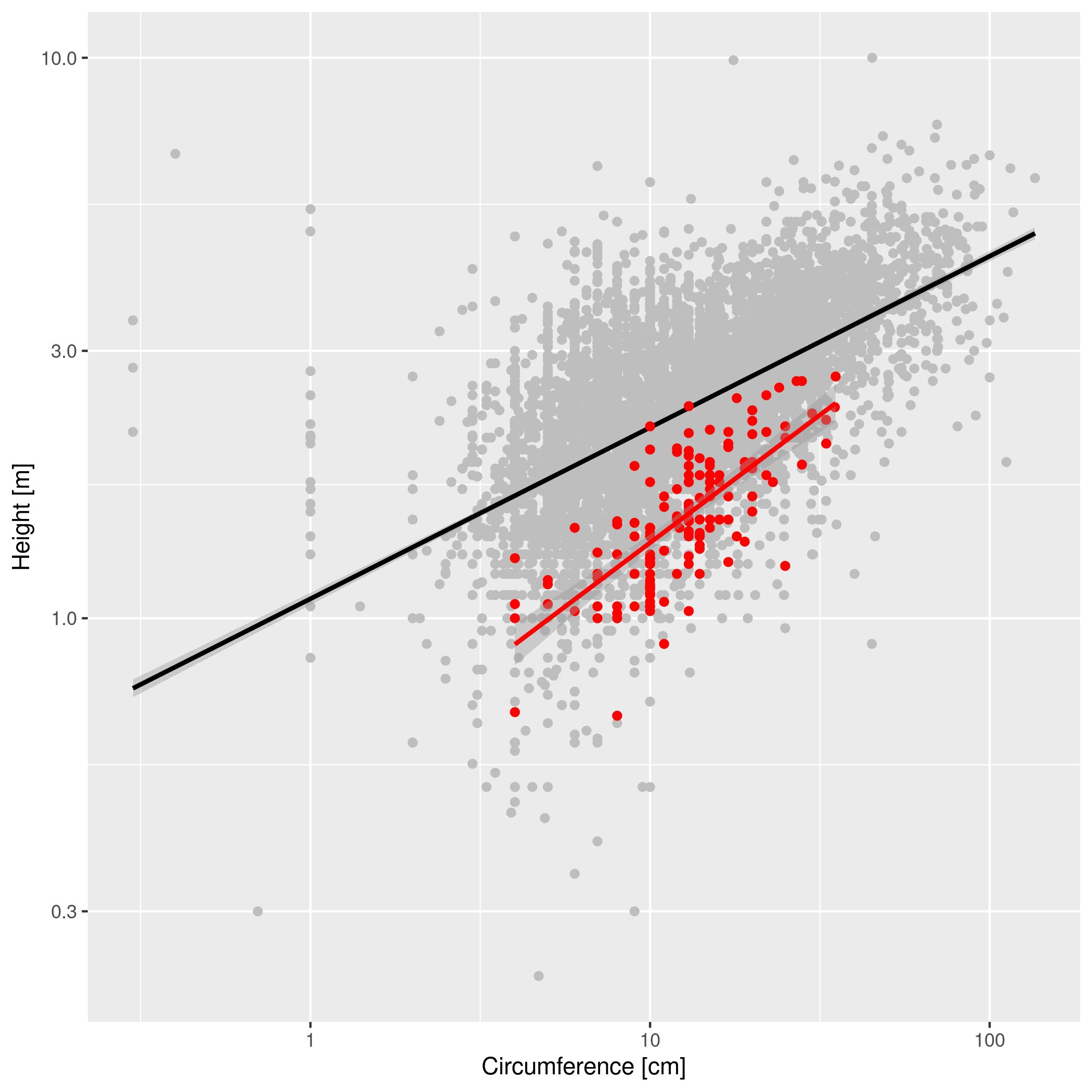
We want to compare the circumference to height relationship in acacia to the same relationship for all trees in the region. These data are stored in two different tables. Make a graph with the relationship between CIRC and HEIGHT for all trees as gray circles in the background and the same relationship for acacia as red circles plotted on top of the gray circles. Scale both axes logarithmically. Include a linear model fitting for both sets of data, trying different linear models specified using the argument method =. Provide clear labels for the axes.
Your plot should look something like this.
Once your are done with the exercises:
- Save your .Rmd file and knit to PDF.
- Add the two files, commit and push to GitHub
- Let your instructor know that changes have been published on GitHub